
EmpowerMend Wellness: A Therapy Practice Website Built to Earn Trust
How I redesigned a therapy practice website from the brand up, then scored it against 13 top practice websites and fixed what mattered most.
At a glance
EmpowerMend Wellness is a therapy practice serving clients in person in Bakersfield and Pasadena and online throughout California.
- Business
- Private therapy practice
- Design
- Full redesign: brand system, homepage, logo lockup, photography direction, team page
- Build
- WordPress custom theme, speed pass, benchmark audit and fixes
- Headline result
- Scored against 13 top practice sites, with the top fixes live
- Timeline
- Spring through fall 2026, in stages
Where it started
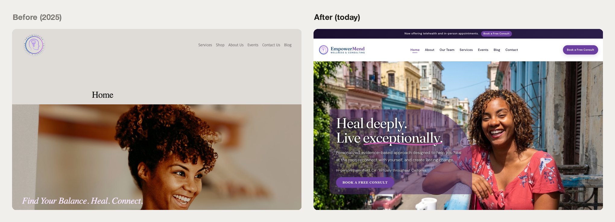
EmpowerMend had a website, but it was working against the practice. The homepage opened with the word “Home” in large type, a soft-focus photo, and a tagline. Nothing on it said what kind of therapy was offered, who it was for, or where.
The site was also built around one person. The practice planned to grow from one clinician to several, and there was no place on the site for a team. The logo had its own problem: the name sat in tiny curved type around a circular badge, and at header size or as the browser tab icon you couldn’t read it.
Then there was speed. Fonts and an icon library loaded before anything else could display, and mobile performance scored about 55 out of 100. The site was slower than it looked.
The design
I began with a brand and site plan built from an interview with the practice owner, then designed the site from that plan. A few principles came out of the interview and shaped everything after. The practice is the brand. Legitimacy comes before personality. Use few words and plenty of white space. Each page has one job, which is booking a free consultation, and the whole thing has to be ready for more clinicians from day one.
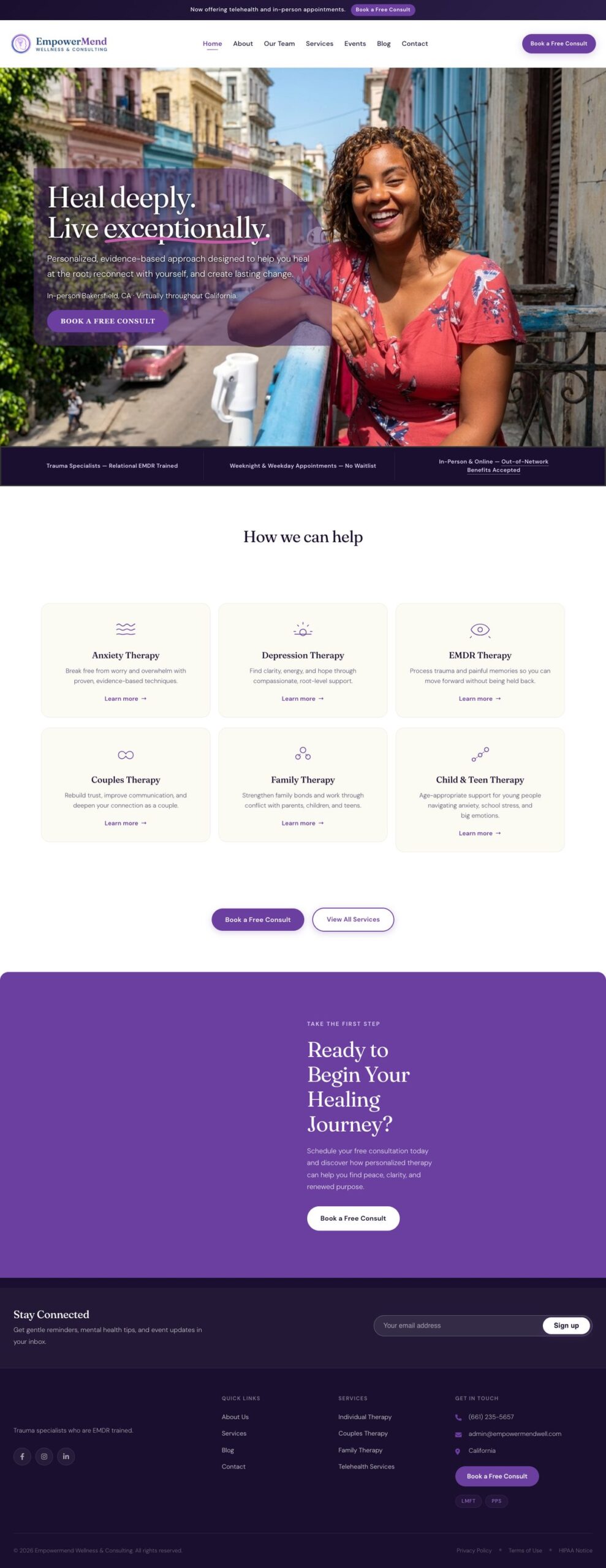
The homepage hero is warm and human. It says “Heal deeply. Live exceptionally.” and then states the approach, where the practice sees clients, and how to start, with one booking button. Directly under it, a band covers the specialties and the practical details people check first: trauma specialists trained in EMDR, weeknight and weekday appointments with no waitlist, in person and online, out-of-network benefits accepted.
Services went from long paragraphs to six labeled cards: anxiety, depression, EMDR, couples, family, and child and teen.
For the logo, I rebuilt the circular badge into a horizontal lockup. It keeps the original head icon and gradient ring, sets the name in the site’s own heading typeface, and stays readable down to a 40-pixel header and a 32-pixel browser icon. I also wrote a photography brief calling for warm, documentary-style images on every service page, with photos of the practice itself where trust matters most. A team page lets new clinicians slot in without redesigning anything.

The speed pass
I removed the fonts that blocked the page from displaying, loaded the essential styling first, and replaced a 255 KB icon library with about 4 KB of icons the site uses.
Benchmarking the therapy practice website
Once the new design was in place, I wanted something firmer than my own opinion of it. I studied 13 high-performing therapy practice websites and distilled what they have in common into 18 conventions, covering site structure, messaging, conversion, visual brand, search, services, and trust. Then I scored EmpowerMend against each one.
The site met 7 conventions, partly met 6, and missed 5. The biggest gap was that there was no contact form anywhere, while all 13 benchmark sites had one. The main “Book a Free Consult” button also led to two different destinations depending on where you clicked it, and the homepage didn’t say who the practice served or where at first glance.
The audit produced a 19-item roadmap, ranked by how much each fix would matter to a prospective client. The top items are now live. Every “Book a Free Consult” button uses the same words and goes to the same scheduling page. The homepage names the locations up front. The contact page now has fee information, a way to send a question, and the Good Faith Estimate notice that federal law requires practices to offer self-pay clients. And some pages had promised a 15-minute consultation while others said 20 minutes, so I corrected that across 11 pages.
Every change shipped with a backup and a written rollback plan, so the live site was never at risk.
What the therapy practice website redesign changed
| Metric | Before | After |
|---|---|---|
| Mobile performance score (Google PageSpeed) | about 55 | 82 after the speed pass, 73 today |
| Desktop performance score | 91 | 100 |
| Time for main content to appear (desktop) | 3.9 seconds | 0.7 seconds |
| Icon library size | 255 KB | about 4 KB |
| Booking button destinations | 2 | 1 |
The practice now has a site that looks like a clinic people can trust and a logo that reads at any size. It also has something most small practices don’t: a score against established competitors and a ranked list of what to do next.
What I’d tell another practice
Before anything else, your homepage should say who you help, where, and how to start. If you’re thinking about another redesign, score the current site against good benchmarks first. It settles the arguments about taste and shows you which fixes are worth paying for. And pick one next step for visitors, with one button that says the same thing and goes to the same place on every page.
How does your practice website measure up?
I offer a fixed-price website audit for therapy practices: your site scored against the best practice websites, with a ranked list of what to fix first. If you want the fixes done too, I design and build the whole thing, start to finish, with no handoffs.