
Mesh Cowork: Redesigning a Coworking Space From Its Own Sign
How I handled a coworking website redesign for my own space in Bakersfield, so the site looks like the place members walk into and loads in about a second.
At a glance
Mesh Cowork is a coworking space in downtown Bakersfield, California. It is my own business, so I live with the results of this coworking website redesign every day.
- Business
- Coworking and office space
- Design
- New visual identity built from the Mesh sign, editorial layout, product chooser, reusable design system
- Build
- Fast static site rebuilt in front of the booking platform
- Headline result
- Main content appears in 1.2 seconds instead of 16
- Timeline
- About three weeks from first sketch to live
The situation
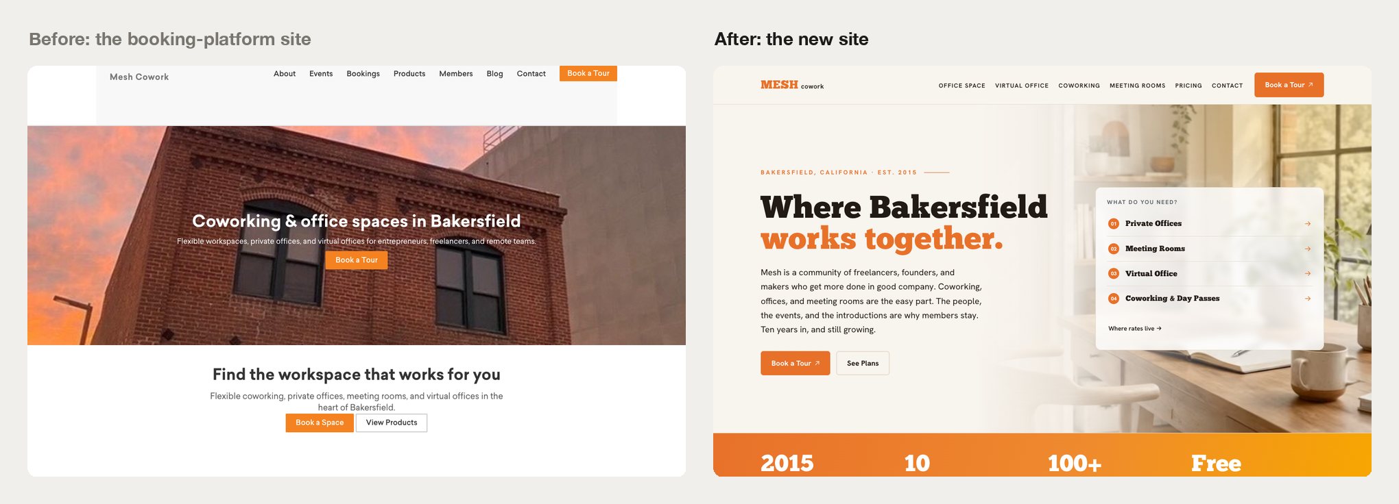
The Mesh website lived inside the coworking booking platform, built from about 120 customized page templates. It looked nothing like Mesh. The space has a warm, bright interior and a backlit orange sign on the street, and the site was a generic platform layout that could have belonged to any coworking space.
It was also slow. On a phone, the main content took more than 12 seconds to appear, and the homepage weighed more than 4 MB. Google’s Lighthouse gave it a mobile performance score of 27 out of 100.
The worst problem was one nobody could see from the outside. Every page told Google it was a copy of the homepage. That single setting kept individual pages, including 95 blog posts, from ranking on their own. And on top of all that, the platform was moving to a new version, which meant rebuilding those templates anyway.
The coworking website redesign
I started with a simple question: what does Mesh look like when you walk in? The identity came from the answer.
My first attempt was a dark, cinematic direction with an elegant serif. It looked good, but it felt nothing like the bright, friendly space members use, so I threw it out and built a direction I called “Daylight.”
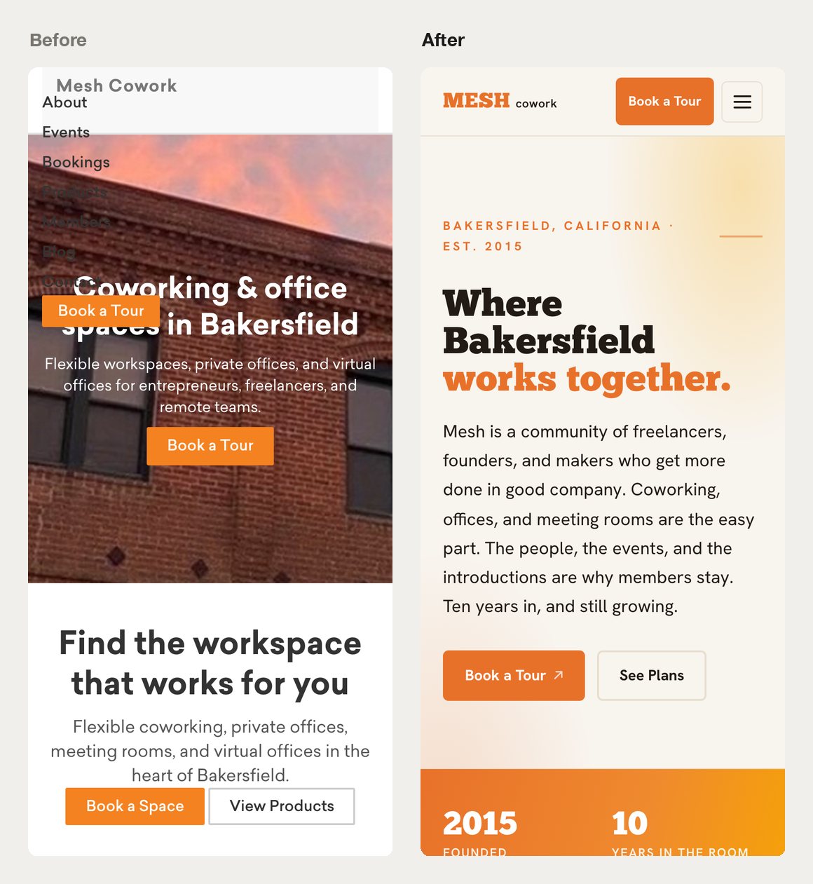
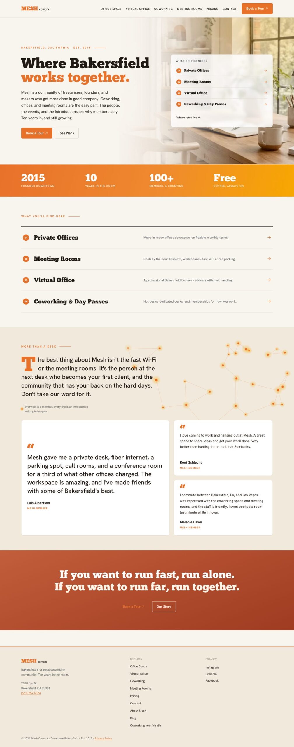
The signature orange is the color of the backlit Mesh sign. The background is a warm off-white, like paper in afternoon light, with sand and terracotta accents. Headlines use a bold slab typeface that echoes the lettering on the sign, paired with a clean body font that is easy to read on a phone.
The homepage leads with the community before the desks: “Where Bakersfield works together,” member testimonials, and a bold orange band of proof points (founded 2015, ten years downtown, 100+ members). Right in the hero, visitors pick what they need, whether that’s a private office, meeting room, virtual office or coworking, in one tap instead of digging through menus.
Underneath it all is a small design system. One spacing rhythm, one set of colors and type sizes, and a “rate card” layout reused on every product page, so a new page looks right without being designed from scratch.
What I built
I didn’t rebuild inside the platform. I built a fast, independent website that sits in front of it. The booking system still handles memberships and reservations. The website loads fast, looks like Mesh, and sends visitors to book.
The site is static and served from Cloudflare’s global network. Pages are pre-built, so there is nothing to compute when a visitor arrives. All 95 blog posts moved over, and each old address permanently redirects to its new one so existing search rankings carry over. Converting the images to a modern format took the library from 115 MB to 3.9 MB with no visible loss in quality.
I also fixed the search basics. Each page now identifies itself correctly, and the site publishes a sitemap and structured business data (address, hours, map location) so Google can show Mesh accurately in local results. A few smaller pieces round it out:
- A contact form that reaches the inbox, with an email fallback if anything fails
- Conversion tracking, so we can see which pages produce inquiries
- Pricing pulled from the booking system, so the website never shows a stale rate
What the coworking website redesign changed
The old site is still running on the booking platform, which made a side-by-side test easy. I measured both on the same day, on a simulated phone over a slow 4G connection, and took the middle of three runs.
| Metric | Old site | New site |
|---|---|---|
| Time for main content to appear | 16.0 seconds | 1.2 seconds |
| Total homepage weight | 4.1 MB | 525 KB |
| The site’s own code and images | 3.2 MB | 75 KB |
| Requests to load the homepage | 70 | 33 |
| Blog image library | 115 MB | 3.9 MB |
| Google Lighthouse mobile score, at launch | 27 | 98 |
The new site went from first sketch to live in about three weeks, and the old platform’s upgrade no longer affects it.
One caveat. Since launch we have added a live chat widget and marketing tags, and they account for most of the new site’s 525 KB and most of its requests. The site’s own code and images are just 75 KB. Every tool you bolt onto a website costs some speed, so I try to make each one a deliberate choice.
If you’re weighing a coworking website redesign
Look at your own business before you look at templates. The Mesh identity was sitting on the front of the building the whole time. And if your booking or scheduling software works fine but your site doesn’t, you probably don’t need to replace both. They can be separate tools. Once the new site is fast, guard that speed: every plugin, widget and tracking tag spends some of it.
Is your website costing you customers?
I design and build websites for small businesses, start to finish, with no handoffs. If your site is slow, looks generic, or is stuck inside a platform you have outgrown, let’s talk about what it would take to fix it.