
What 13 Top Therapy Practice Websites Have in Common
Before I redesign a website, I want evidence of what works to go along with my opinion. For a therapy practice I worked with, I studied 13 well-built, high-performing therapy practice websites, from solo clinicians to group practices with more than a dozen therapists. I went through every homepage, service page, and contact page and wrote down what they had in common.
The patterns were very consistent. Below is what the best practice websites do, how many of the 13 did it, and why it matters to someone looking for a therapist.
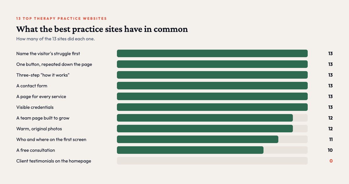
1. They talk about the visitor's struggle before the practice (13 of 13)
All 13 sites had a section near the top of the homepage that names what the visitor is going through, with phrases like “Does every conversation feel like a battle?” or “If any of this feels familiar, you are in the right place.”
Someone looking for therapy is often anxious and unsure they belong. Naming their experience first tells them they are in the right place before you ask them to do anything.
2. The first screen says who they help and where (11 of 13)
The top of the homepage states both the people the practice serves (adults, couples, teens, families) and the region it serves. A visitor should know within seconds whether this practice can see them, and if they have to dig for it, many will not.
3. One button, repeated all the way down the page (13 of 13)
Every site had a single main action, such as “Book a Free Consultation” or “Get Started,” repeated five to seven times from the header to the footer, with the same words and the same destination each time.
Many practice sites quietly lose people here. On the site I was redesigning, the main button went to two different places depending on where you clicked it, and fixing that was one of the first changes we made.
4. A free consultation (10 of 13)
Most offered a free short consultation, often 15 or 20 minutes. Starting therapy is a big step, and a free conversation makes the first part of it smaller.
Make sure the details match everywhere. We found pages on one site promising a 15-minute consultation and others promising 20, and corrected it across 11 pages.
5. A simple "how it works" in three steps (13 of 13)
Every site explained the process in three short steps, usually some version of “we get to know you, we make a plan, we help you move forward.” It answers the quiet question every new client has, which is what happens after they click.
6. A contact form (13 of 13)
All 13 had a contact form, and several placed one right on the homepage. Some people are not ready to book and want to ask a question first. A form lets them do that in the moment instead of later, which often means never.
7. A team page built to grow (12 of 13)
Nearly every practice had a team page with a photo, specialties, and a link to a full bio for each clinician. Even practices with one or two therapists build it this way, so adding a new clinician never means redesigning the site.
8. A page for every service, written for local search (13 of 13)
Every site had separate pages for each service or population, such as anxiety, couples, or teens. Most titled those pages with the service and the city, so they show up when someone searches for “couples therapy” plus their town.
9. Warm photos and visible credentials (12 to 13 of 13)
Twelve used warm, original photography and therapist headshots instead of generic stock images. All 13 showed credentials, and most linked to a Psychology Today profile, which many people use to check out a therapist before reaching out.
What none of them did: client testimonials (0 of 13)
Not one of the 13 sites had client testimonials on the homepage. Professional ethics guidance for many mental health clinicians discourages soliciting testimonials from clients, and confidentiality matters more than social proof. These sites build trust through credentials, a clear process, and a warm voice.
If someone tells you your practice website needs reviews on the homepage, check your profession’s ethics code first.
How one practice measured up
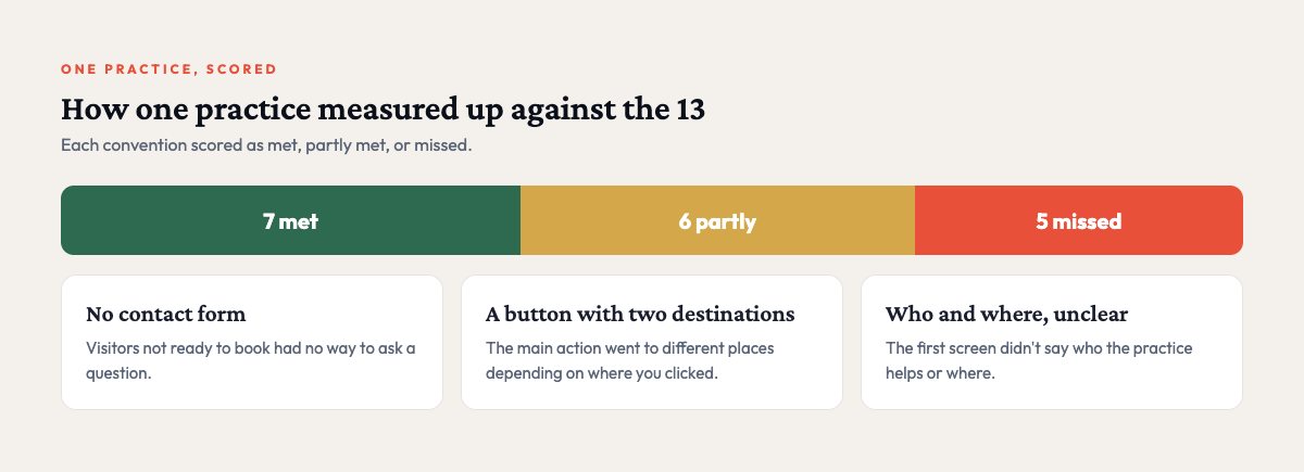
When I scored the practice I was working with against these conventions, it met 7, partly met 6, and missed 5. The biggest gaps were no contact form, a main button that went to two different places, and a homepage that did not say who or where at first glance. The top fixes are now live. You can read the full story in the EmpowerMend Wellness case study.
Field Notes from 521
One useful email a month.
Practical notes on automation, AI, and websites for small businesses, from real projects with real numbers. No spam, and you can unsubscribe anytime.
We use Mailchimp to send these emails. See our privacy policy.
Score your own site
Go through the list above with your homepage open and count how many you meet. Most practices I look at miss at least three. The fixes are usually small ones, like a clearer first screen, one consistent button, a contact form, and a short “how it works.” If you would like an objective score for your site, or want to see which parts of your practice's admin work are worth automating, answer a few questions and pick a time to talk.